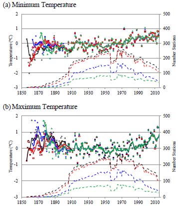
Fig. (3) Plot of (a) Minimum and (b) Maximum Temperature relative to the 20th century. Raw data are displayed as black circles. Red squares (blue diamonds) are data filtered using Ns = 10 (5) points to determine whether a discontinuity occurred as discussed in the text. Green triangles show data for stations where no discontinuities were found. The solid curves are the corresponding running 5 year averages which closely overlap in many years. The dashed curves show the corresponding number of stations.