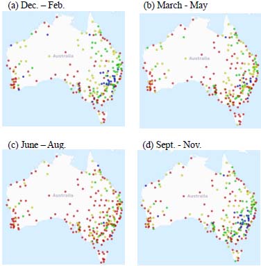
Fig. (6) Maximum Temperature trends at stations having data present for at least 50% of all years during 1907-2015 for (a) December - February, (b) March – May, (c) June - August and (d) September - November. Red (blue) dots represent increasing (decreasing) trends significant at the 5% level. Yellow (green) dots represent increasing (decreasing) trends that are not statistically significant.