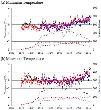
Fig. (8) Comparison of adjusted GHCN and ACORN data as well as this work relative to the 20th century for (a) Minimum and (b) Maximum Annual Temperature. The red triangles are the GHCN results, blue squares are the ACORN results and the black dots are from this work. The solid red, green and black curves are the 5 year running averages which closely overlap in many years. The dashed lines give the corresponding number of stations.