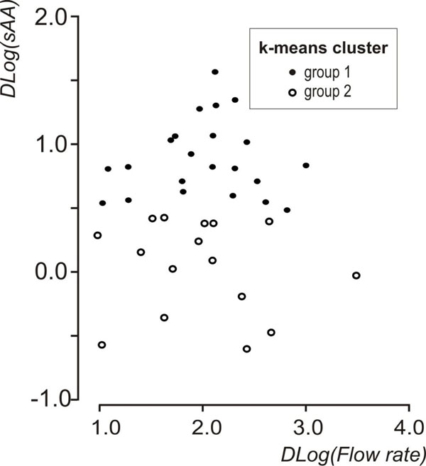
Fig. (2)
Scatterplot of Dlog(flow rate) vs Dlog(sAA) showing the groups that emerged after the k-means cluster analysis on Dlog(sAA).