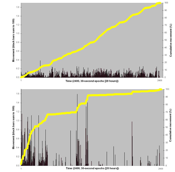
Fig. (1) Examples of ‘low’ variability (top) and ‘high’ variability (bottom) actiwatch traces. Data have been normalised to 100% to facilitate direct between-subject comparison. Thus vertical black bars (left hand Y-axis) sum to 100, and yellow line (right hand Y-axis) ascends to 100% for each subject across 2400, thirty-second epochs (i.e. 20 hours).